

Brocade theme documentation
Brocade is a Shopify theme for clothing labels that sell through visuals and fit, especially ethnic, occasion and handcrafted wear. This guide shows you how to install it, set it up and make it your own, without touching code.
What's included
- Editorial home page sections: hero slideshows, collection showcases, a spotlight carousel, shoppable videos and stories, testimonials and more.
- A product page built to reduce returns: a size chart popup in cm and inches, a clear variant picker, product tabs in an accordion, a shipping timeline and pickup availability.
- Quick view, quick add to cart, a slide-out cart with a free shipping bar, cart notes, gift wrap and recommendations.
- Collection filters and sorting with color swatches, predictive search and a mega menu.
- Built-in support for Shopify features: dynamic checkout buttons, Shop Pay Installments, local pickup, complementary products, gift cards, Follow on Shop and the customer account menu.
Install Brocade
You can try Brocade for free before you buy it. Merchants only pay when they publish the theme.
- From the Shopify Theme Store, open the Brocade page and click Try theme. Brocade is added to your theme library as an unpublished theme.
- In your Shopify admin, go to Online Store → Themes.
- Find Brocade in the theme library and click Customize to open the theme editor. Set it up while your current theme stays live.
- When you're ready, click Publish next to Brocade. Pay for the theme if you haven't already.
Demo store images don't transfer when you install a theme. You'll see placeholder images until you add your own. All layout, color and font settings match the demo.
First-time setup checklist
Work through these steps in order. Most stores are ready in an afternoon.
- Add your logo and favicon. Theme settings → Logo and favicon. See Logo and favicon.
- Set your colors and fonts. Theme settings → Color schemes and Typography.
- Create your menus. In Shopify admin, go to Online Store → Navigation. Edit Main menu for the header and Footer menu for the footer. Nest links under a parent link to make drop-down menus.
- Fill in the home page. Replace the placeholder images and text in each section. Delete the sections you don't need.
- Set up the product page. Add your size charts and check the buy buttons. See Product page.
- Turn on filters. Install the free Shopify Search & Discovery app and choose your filters. See Filters and sorting.
- Add your social media links. Theme settings → Social media.
- Check your store on a phone. Use the mobile preview button at the top of the theme editor.
Using the theme editor
Every change in Brocade is made in the theme editor. To open it, go to Online Store → Themes and click Customize.
- Choose a page from the drop-down at the top of the editor: Home page, Products, Collections, Cart and so on.
- Sections are the large building blocks of a page, like a slideshow or a product grid. Click Add section in the left sidebar to add one.
- Blocks are the smaller pieces inside a section, like a single slide or the price on a product page. Click a section, then Add block.
- Drag sections and blocks by their handle to reorder them. Click the eye icon to hide one without deleting it.
- Theme settings (the brush icon) holds options that apply to the whole store, such as colors, fonts and product cards.
Tip: Before big changes, duplicate your theme from Online Store → Themes → … → Duplicate. That gives you a backup you can go back to.
Logo and favicon
Go to Theme settings → Logo and favicon.
| Setting | What it does |
|---|---|
| Logo | Your main logo. Use a .png or .svg with a transparent background. Landscape and portrait logos both work. |
| Logo (Dark) | A dark version for light backgrounds, used by headers set to the dark logo style. |
| Logo (White) | A light version for dark backgrounds or the transparent overlay header. |
| Logo width (desktop and mobile) | Sets the logo size separately on each device. |
| Favicon | The small icon in the browser tab. Upload a square image, at least 32 × 32 px. |
If you don't upload a logo, the header shows your store name as text. You can change that text in the Header section under Logo text.
Colors and color schemes
Brocade uses color schemes. A scheme is a named set of colors: background, text, buttons and borders. You set it up once and pick it in any section.
- Go to Theme settings → Color schemes.
- Click a scheme to edit its colors, or click Add scheme.
- In any section, open Color scheme and choose the scheme you want.
Keep enough contrast between text and background so everyone can read your store. Aim for a contrast ratio of at least 4.5:1 for body text. Free tools such as the WebAIM Contrast Checker can check this for you.
Some sections also have their own color pickers, for example card colors or button colors. These override the scheme for that one section.
Typography
Go to Theme settings → Typography. Fonts come from the Shopify font library, so they load fast and need no extra setup.
| Setting | What it does |
|---|---|
| Heading font / Body font | Pick any font from the Shopify font library. Bold and italic styles load automatically. |
| Default font weights | The standard weight for headings, subheadings and body text. |
| Heading sizes (desktop and mobile) | Pixel sizes for H1 to H6, set separately for each device. |
| Body text sizes | Size of paragraph text and small captions. |
| Heading text style | Text transform (none, capitalize, uppercase) and letter spacing. |
| Button | Button font, text transform and rounded corners. |
Layout, spacing and animation
- Layout: page width, a full-width (fluid) option and the page side margin.
- Section: the space between sections on desktop and on mobile.
- Animation: image zoom on hover, a scroll animation for sections as they appear, and card hover effects. Choose None to turn animations off.
Most sections also have their own padding settings, plus optional divider lines at the top and bottom.
Product cards and badges
Product cards show products in grids and sliders across the store. Go to Theme settings → Product cards.
| Group | Options |
|---|---|
| Product actions | Show quick view, an add to cart button, color swatches and a quantity input. |
| Product info | Alignment, title size and weight, title truncation, price size, vendor, short description and star rating. |
| Product image | Show the second product image on hover, image ratio (or a custom ratio) and the hover effect. |
| Card shadow | A shadow on the card, always or only on hover. |
| Catalog mode | Hide prices and buy buttons to use your store as a lookbook or wholesale catalog. |
| Mobile options | Show product actions on phones too. |
Badges
Go to Theme settings → Badges. Each badge has its own color, background and on/off switch.
- Sale: shows when a product has a compare-at price. Choose a plain, scrolling or countdown style. The countdown style needs a real end date (see the FAQ).
- New: shows on products added recently. Set how many days a product counts as new.
- Pre-order and Sold out: show automatically based on inventory.
- Custom badge: add your own label, for example "Handwoven".
Color swatches
Swatches show product colors as small circles instead of text. Go to Theme settings → Color swatches to turn them on, choose the option names that trigger them (for example Color and Size), and set the swatch size and shape.
Brocade reads swatch colors and images from Shopify. In your admin, open a product, edit the Color option and pick a color or image for each value. That's the same data Shopify uses for filters, so set it once and it works everywhere.
Cart settings
Go to Theme settings → Cart.
| Setting | What it does |
|---|---|
| Action after added to cart | Open the cart drawer, go to the cart page, or stay on the page. |
| Free shipping message | Shows a progress bar toward free shipping. Enter the same minimum amount as your shipping settings in Shopify. |
| Cart note | Lets customers leave a note with their order. |
| Discount code | Shows a field for discount codes in the cart. |
| Gift wrap | Offers gift wrap as an add-on. Create a product called "Gift wrap" with a price, then choose it here. |
| Product recommendations | Shows suggested products in the cart drawer and on the cart page. |
Other settings
- Terms and conditions checkbox: asks customers to agree to your terms before checkout. You can show it in the cart, on the product page and in quick view, and link it to your terms page.
- Preloader: a short loading screen with a spinner or your logo. Keep it off for the fastest store, or set it to show only once per visit.
- Site style: right-to-left support. See Languages and right-to-left.
Header and navigation
The header area sits at the top of every page. In the theme editor it holds these sections:
| Section | Use it for |
|---|---|
| Top bar | A thin bar with your phone, email and social icons. |
| Announcement bar ticker | Scrolling messages such as "Free returns within 14 days". Add one block per message. |
| Header 1 | The standard header with logo, menu, search, account and cart. |
| Header 2 (overlay) | A transparent header that sits over the first section, best with a full-width hero image. |
Menus and the mega menu
The header shows your Main menu. Links nested one level deep appear as a drop-down; links nested two levels deep appear as columns. To add product cards inside a drop-down, add a Mega menu products block to the header and pick the menu item and the products or collection to show.
Search and account
- Predictive search shows products, collections, pages and articles as customers type.
- Account menu: the account icon lets customers sign in without leaving your store, including with Shop. It shows on desktop and mobile when customer accounts are turned on in Settings → Customer accounts.
- On phones, the menu opens as a slide-out drawer.
A sticky header that stays visible while customers scroll is available in the header settings.
Home page sections
Brocade comes with many sections. Add any of them with Add section and use only the ones that suit your brand. Every section has its own color, spacing and divider settings, and most have separate desktop and mobile layout options.
Hero and banners
| Section | What it shows | Tips |
|---|---|---|
| Hero slider V1 | Full-width slideshow with heading, text and buttons on each slide. | Upload separate desktop (2400 × 1300 px) and mobile (900 × 1200 px) images. Keep text out of the images so it stays readable on every screen. |
| Hero slider V2 | Slideshow with side text and an image overlay. | Good for fewer, bolder slides. |
| Split hero banner | Image or video on one side, text and button on the other. | Use for a launch or a single collection. |
| Shoppable hero | Full-width image with product tags customers can tap to shop the look. | Add one Product tag block per product and position it on the image. |
| Page banner | A heading over an image or video, for the top of inner pages. | Works well on About and Contact pages. |
| Category split banner, Craft banner, Discovery banner | Editorial image-and-text banners in different layouts. | Use one or two between product sections to tell your story. |
| Sale timer banner, Sale timer strip | A countdown to the end of a real sale. | Set the actual end date and time. The timer hides itself when the sale ends. |
Collections
| Section | What it shows |
|---|---|
| Collection showcase | Shop by category cards in an editorial grid, an arch row or one line. Add one Category block per collection, with an optional badge such as "Bestseller". |
| Spotlight collection | A coverflow carousel: the center card is largest and the side cards step back. Customers swipe on mobile. |
| Collection list V1, V2, V3 | Grids and scrollers of collection cards with images and labels. |
| Collection tabs V1, V2, Bestsellers | Product grids with tabs, one tab per collection. |
| Product list | A grid of products from one collection, with optional filters. |
| Featured product | One product with its images, options and buy button on the home page. |
Video and social proof
| Section | What it shows |
|---|---|
| Shoppable videos V1 | A row of short vertical videos. Tapping one opens it full screen with the product and an add to cart button. |
| Shoppable video reviews | Customer review videos with the reviewed product. |
| Stories | Round story bubbles like social apps. Each opens a full-screen video. |
| Wave testimonials | A slider of customer quotes with photos. |
| Before and after | An image slider customers drag to compare two images, with a checklist. |
Upload videos in Content → Files in your admin, or pick them directly in the section. Keep each video under 30 seconds and under 20 MB so it loads quickly.
Brand story
Founder quote, Mission split, Philosophy, Three pillars, Feature points, Comparison section and Split info tell customers who you are and why your products are different. Blog showcase shows your latest articles.
Promotions
- Promo cards: a slider of offer cards, each with an image, text and link.
- Build your bundle: customers pick products and see the bundle price. Create the matching automatic discount in Discounts so the price at checkout matches.
- Marquee V1: a scrolling line of text or logos.
- Newsletter popup: collects emails into your Shopify customer list. Set when it appears and how often.
- Cookie consent bar: asks visitors to accept cookies.
Your own content
Custom section lets you build a section from blocks. Custom Liquid and Custom HTML let you paste code, for example an embed from another service. See Custom code.
Product page
Open the theme editor and choose Products → Default product from the page drop-down. The Product detail section holds the gallery on the left and blocks on the right. Add, remove and reorder blocks to suit your products.
Gallery
In the Product detail section settings you can choose the gallery layout, thumbnail style, image zoom, product badges and a sticky add to cart bar that appears when customers scroll past the buy buttons. The gallery supports images, videos, YouTube and Vimeo links and 3D models. When a customer picks a variant, the gallery jumps to that variant's image.
Blocks
| Block | What it does |
|---|---|
| Title, Vendor, Star rating | The product name, brand and average rating. Ratings come from a product reviews app. |
| Premium price | Price, compare-at price, the amount saved, unit price and a tax note. |
| Highlight pills | Short labels such as "Pure cotton" or "Handmade". |
| Premium variant picker | Buttons or swatches for each option. Sold-out combinations are crossed out. |
| Size chart | A link that opens a size chart popup. See Size chart. |
| Buy buttons | Quantity, Add to cart, an optional Buy now button, dynamic checkout buttons (such as Shop Pay), Shop Pay Installments and a gift card recipient form. |
| Pickup availability | Shows if the selected variant can be picked up in store. See Local pickup. |
| Complementary products | "Pairs well with" suggestions. See Product recommendations. |
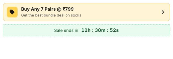
| Bundle offer and timer | An offer card with an optional countdown to a fixed end date. |
| Mix and match discount, Volume discounts | Show tiered prices such as "Buy 2, save 10%". Create the matching automatic discount in Shopify so checkout prices match. |
| Stock countdown | A low stock bar based on your real inventory. It only appears below the number you set. |
| Shipping estimate | An ordered, shipped and delivered timeline with estimated dates. |
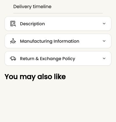
| Accordion | Collapsible tabs for description, fabric and care, returns and more. Each row can show an icon. |
| Secure checkout, Trust badges, Trust banner, Payment badges | Reassurance blocks. Payment icons come from the payment methods you've turned on in Shopify. |
| How to use, Benefits list, Ingredients, Custom text | Extra product details such as styling tips or care steps. |
| UGC product videos | Short customer videos for the product. |
| Divider, Custom Liquid, app blocks | Spacing, custom code and blocks from apps you install. |
Use different layouts for different products
You can give sarees, kurta sets and accessories their own layouts:
- In the theme editor, open the page drop-down, choose Products → Create template and name it, for example "saree".
- Change the blocks for that template.
- In your admin, open each product and choose the new template under Theme template.
Collection and search pages
Choose Collections → Default collection in the theme editor. The Collection main section shows a banner with the collection title, description and image, then the product grid.
- Set the number of products per row on desktop and mobile and the product card options.
- Turn filtering and sorting on or off under Filtering and sorting.
- Products load as customers scroll (infinite scroll) or with pagination.
- Add Collection banner blocks to place promotions in the grid.
The search page uses the same grid and filters, and also lists matching pages and blog articles. The collections list page (/collections) shows all your collections as cards.
Cart page and cart drawer
The cart drawer slides in from the side when a customer adds a product. It shows the items, quantity controls, savings, a free shipping progress bar, recommendations, gift wrap, an order note and the checkout button. Edit it from any page in the theme editor under Cart drawer.
The cart page (/cart) shows the same information on a full page, along with dynamic checkout buttons such as Shop Pay, Apple Pay or PayPal, depending on the payment methods you've turned on. Discounts, subscriptions (selling plans) and unit prices appear on each line.
About, contact and FAQ pages
Brocade includes page templates ready to use:
| Template | How to use it |
|---|---|
| page.about | A story page with a page banner, founder quote and mission sections. |
| page.contact | A contact form and contact info cards. Messages go to your store's sender email. |
| page.faq | FAQ sections with questions grouped by topic. Add one FAQ item block per question. |
| page.sections | An empty page you build from any sections. |
- In your admin, go to Online Store → Pages and click Add page.
- Give it a title, for example "Contact us".
- Under Theme template, choose the matching template, for example contact, and save.
- Add the page to your menu in Online Store → Navigation.
The Sizing guide section adds a full size guide page with a size table and fit tips.
Blog
Write posts in Online Store → Blog posts. The blog page shows posts in a grid with their image, title, date and excerpt. Article pages show the full post, comments (if your blog allows them) and an optional best sellers sidebar. To show recent posts on your home page, add the Blog showcase section.
For the cleanest grid, give each post a featured image with the same shape, and write a short excerpt.
Size chart
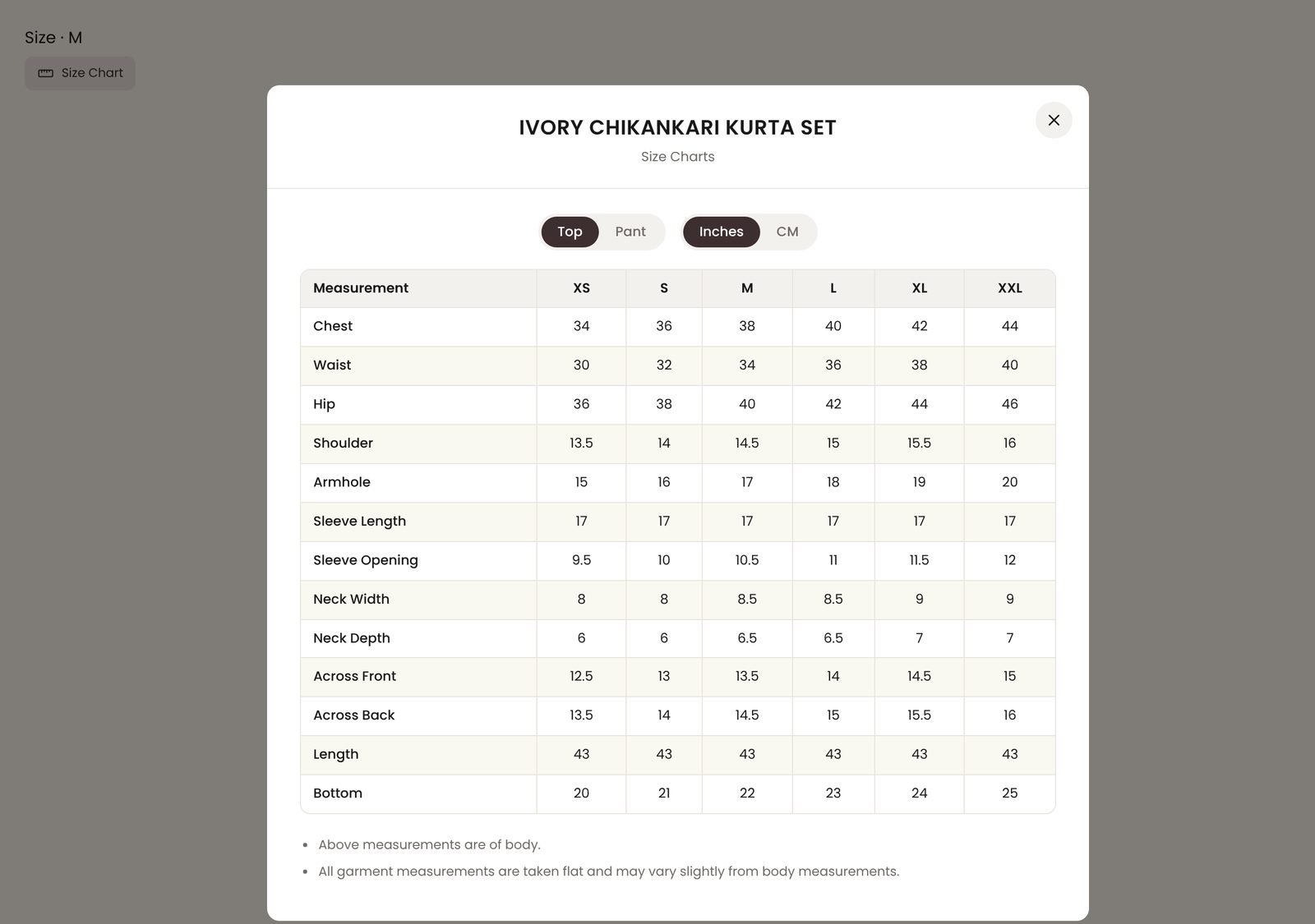
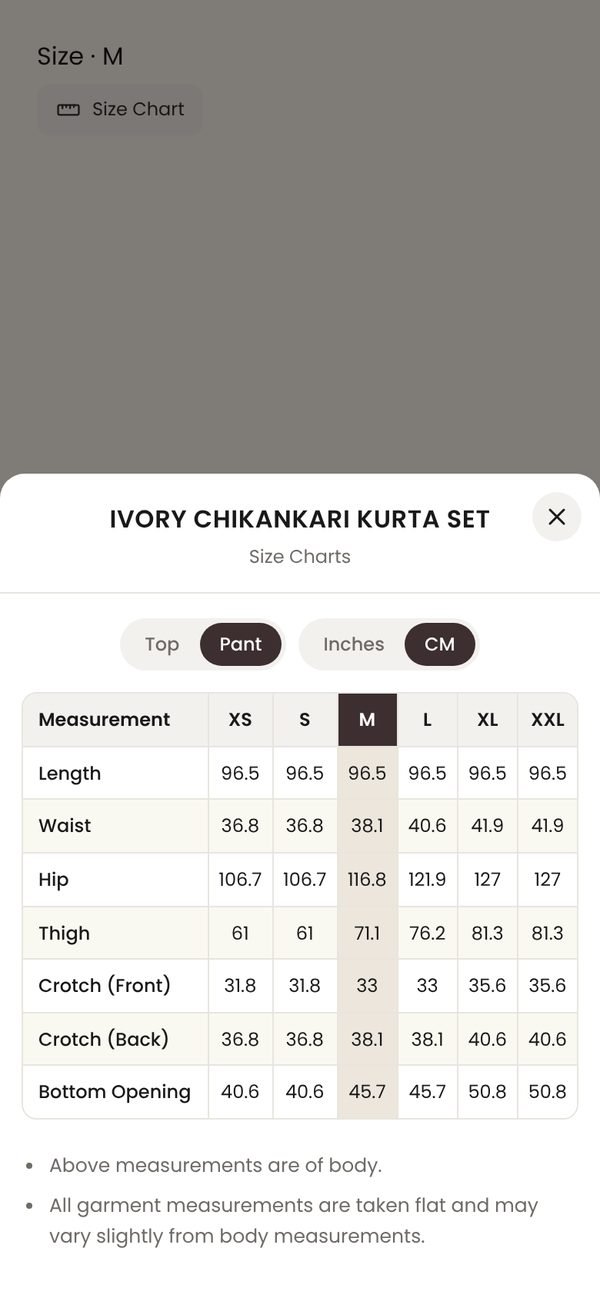
The size chart block adds a Size chart link next to your size options. It opens a popup with separate charts for tops and bottoms, and customers can switch between inches and centimeters.
- On the product page in the theme editor, click Add block → Size chart and drag it under the variant picker.
- Under Top chart and Pant chart, enter your measurements for each size. Leave a chart empty to hide its tab.
- Choose the default unit, add notes such as "Measurements are body measurements", and add an optional measuring guide image.
- For a completely different chart, paste your own table in Custom HTML tables.
To use different charts for different product types, create a product template for each type (see Product page) and set up its size chart block.
Filters and sorting
Brocade shows filters that you set up in Shopify. It supports filters for availability, price, product type, vendor, tags and variant options such as size and color, with color swatches for color filters.
- Install the free Shopify Search & Discovery app.
- In the app, go to Filters and add the filters you want, for example Size, Color, Fabric and Price.
- In the theme editor, check that filtering is turned on in the Collection main section and the Search section.
Sorting options (featured, best selling, price, date) are always available.
Product recommendations
Brocade shows two kinds of recommendations on product pages:
- Related products ("You may also like"): the Recommended products section below the product. Shopify picks these automatically from sales and product data.
- Complementary products ("Pairs well with"): the Complementary products block. You choose these yourself in the Search & Discovery app under Product recommendations. The block stays hidden for products that have none.
Local pickup
If customers can collect orders from your shop, the Pickup availability block shows whether the selected size or color is ready for pickup, and where. It updates when the customer changes the variant.
- In your admin, go to Settings → Shipping and delivery → Local pickup and turn it on for your location.
- Make sure the location stocks the product.
- The block appears on its own. You can change its wording in the theme editor.
Gift cards
- Create a gift card product in Products → Gift cards.
- On the gift card's product page, customers can send it to someone else. They enter the recipient's email, an optional name and message, and a delivery date. Turn this on or off in the Buy buttons block.
- The gift card email links to a page showing the balance, the code, a QR code for in-store use and an Add to Apple Wallet button.
Languages and right-to-left
To edit the theme's wording, such as button labels and cart text, go to Online Store → Themes → … → Edit default theme content. To sell in more languages, add them in Settings → Languages and translate with the free Translate & Adapt app.
For Arabic, Hebrew and other right-to-left languages, go to Theme settings → Site style, turn on Enable RTL and enter the language codes to flip the layout for.
Custom code
Most stores never need code with Brocade. If you do want to add some:
- Use the Custom Liquid section or block for small additions, such as an embed from another service.
- To add your own CSS, add a Custom Liquid section and wrap your CSS in
<style></style>tags.
Always duplicate your theme before editing code, from Online Store → Themes → … → Duplicate. Changes to theme files are lost when you update to a new version of Brocade, so keep notes of what you change.
OptixFusion support can't write or fix custom code. For larger changes, we recommend hiring a developer from the Shopify Partner Directory.
Updating the theme
When a new version of Brocade is released, Shopify shows an update notice in Online Store → Themes. Updating adds a new copy of Brocade to your theme library with your theme editor settings carried over. Your current theme isn't changed until you publish the new copy.
- Click Update (or View update) next to Brocade.
- Preview the new copy and check your key pages.
- Publish it when you're happy.
Code you edited yourself isn't carried over. Copy those changes again after updating.
Frequently asked questions
Why do I see gray placeholder images?
Demo images don't transfer when you install a theme. Click each section in the theme editor and upload your own images. Placeholders disappear as soon as you add an image.
What image sizes should I use?
- Hero slides: 2400 × 1300 px on desktop, 900 × 1200 px on mobile.
- Product images: square or portrait (3:4), at least 2000 px on the long side. Use the same shape for every product for a neat grid.
- Collection images: portrait, at least 1200 px tall.
Shopify resizes and compresses images for you. Set a focal point on an image in Content → Files to control how it's cropped.
My filters aren't showing on collection pages.
Filters come from the Shopify Search & Discovery app. Install it, add filters under Filters, and check that filtering is turned on in the Collection main section. Collections with more than 5,000 products don't show filters (a Shopify limit).
How do I add a size chart to only some products?
Create a product template that includes the Size chart block, and assign it to the products that need it. Products on other templates won't show the chart.
Do the volume discount and bundle blocks apply discounts automatically?
No. These blocks show your offer on the product page. The discount itself comes from Shopify. Create a matching automatic discount in Discounts so the price at checkout matches what customers see.
How does the sale countdown work?
Countdown timers in Brocade count down to a real end date that you enter, in your store's time zone. When the date passes, the timer hides or shows your "Sale ended" message. Brocade doesn't include fake timers that restart for each visitor.
Where do product reviews come from?
Install a product reviews app from the Shopify App Store. Most apps add a rating block you can place on the product page, and the Star rating block shows the average rating that apps save to your products.
Why don't the dynamic checkout buttons show?
They only appear for payment methods turned on in Settings → Payments, and they're hidden in the theme editor preview for some methods. Check your live store, and check that Show dynamic checkout buttons is on in the Buy buttons block.
Can I use my own fonts?
Brocade uses the Shopify font library, which has hundreds of fonts and keeps your store fast. Uploading your own font files needs custom code, which our support doesn't cover.
Can I use Brocade on more than one store?
Each purchase covers one store. You can duplicate the theme within that store as often as you like.
Is Brocade fast on mobile?
Yes, as long as images and videos are a sensible size. Compress large videos, keep the preloader off, and only use the sections you need. Apps add their own code, so check speed after installing one.
Support policy
Every Brocade purchase includes free support from the OptixFusion team.
Response time
We reply within 2 business days, Monday to Friday, except public holidays. Critical bugs that stop customers from buying are fixed as quickly as possible.
What's included
- Help with installing and setting up Brocade.
- Questions about theme settings, sections and blocks.
- Fixing bugs in the theme's own code.
- Advice on Shopify features the theme supports.
What's not included
- Custom design or code changes, or fixing changes you or someone else made to theme code.
- Installing, setting up or fixing third-party apps, or conflicts caused by apps.
- Moving content from another theme or store.
- Store setup outside the theme, such as products, shipping or payments. For those, contact Shopify Support.
Before you contact us, please try the steps in this guide and the FAQ. When you write, tell us which page, which device and what you expected to happen. That helps us answer faster.
Release notes
Version 1.0.0
First release of Brocade.
- Editorial home page sections, including collection showcase, spotlight carousel, shoppable videos and stories.
- Product page with size chart, variant picker, accordion, shipping estimate, pickup availability and complementary products.
- Slide-out cart with free shipping bar, gift wrap, order notes and recommendations.
- Collection filters with swatches, predictive search and mega menu.
- Support for dynamic checkout, Shop Pay Installments, gift card recipients, Follow on Shop and the customer account menu.
Brocade is a Shopify theme by Optixfusion. Shopify is a trademark of Shopify Inc.
Social media
Go to Theme settings → Social media and paste the full link to each profile, for example
https://instagram.com/yourbrand. Icons only appear for the links you fill in. Brocade supports Facebook, Instagram, TikTok, X, YouTube, Pinterest, LinkedIn, Snapchat, Vimeo, WhatsApp and Tumblr.The image people see when they share your store comes from Online Store → Preferences → Social sharing image in your admin.